Custom Pushpin in Bing Maps Control for WPF
Pushpins in "Bing Maps Control for WPF" can be styled in XAML.
The code below may seem a bit much, but this is actually very flexible and easy to adjust. And it doesn't require code-behind that is forgotten when copying, problems with change of names that isn't reflected in code or overriding rendering events.
It also get additional benefits at a later stage since this can also contain text(see below) be data-bound, bound to other controls or templates or be rotated and transformed. We could also control size or placement according to converters related to real-world sizes like meters or have it's visbility set according to zoom-level. This is out of scope here but I will try to get to that later.
In the example below the styles are placed inside the map-control in
Here's the XAML Block for displaying a map with a Pushpin as a custom ellipse:
The PushPin is defined inside the style:
Here you could add other elements such as Paths, Rectangles, Images or even Text.
An elipse should be centered over the point, so the
The other setter properties in the style is setting some important properties for the Pushpin.
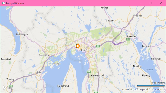
The example above should be something like this:
The Pushpin can the be used like this:
The text in the property [Content=""] is bound in the style as the first line, and the [Location=""] is bound as the second line.
The result should be something like this:
The code below may seem a bit much, but this is actually very flexible and easy to adjust. And it doesn't require code-behind that is forgotten when copying, problems with change of names that isn't reflected in code or overriding rendering events.
It also get additional benefits at a later stage since this can also contain text(see below) be data-bound, bound to other controls or templates or be rotated and transformed. We could also control size or placement according to converters related to real-world sizes like meters or have it's visbility set according to zoom-level. This is out of scope here but I will try to get to that later.
In the example below the styles are placed inside the map-control in
<m:Map.Resources> . This is handy when designing or for a cut-copy-paste library. But this get quite a bit readable when it's moved into an Application.Resource in App.Xaml or in it's own resource files.Here's the XAML Block for displaying a map with a Pushpin as a custom ellipse:
<m:Map Center="59.913033, 10.741301" Name="MyMap" CredentialsProvider="YOUR-BINGMAP-KEY" ZoomLevel="10">
    <!-- Resources may alo go into the Window.Resources or Application.Resourcesor
         or own resource files -->

            <m:Map.Resources>
                <Style TargetType="m:Pushpin" x:Key="MyPushPinStyle">
                    <Setter Property="OverridesDefaultStyle" Value="True" />

                    <!-- This is important in relation to the content. See comments -->
                    <Setter Property="PositionOrigin" Value="Center" />

                    <Setter Property="Background" Value="Transparent" />
                    <Setter Property="BorderBrush" Value="Transparent" />
                    <Setter Property="BorderThickness" Value="0" />
                    <Setter Property="Template">
                        <Setter.Value>

                            <ControlTemplate TargetType="m:Pushpin">
                                <!-- Using a grid so the ellipses get drawn on top of each other -->
                                <!-- When changing the content below update the PositionOrigin according to wher you want to place the content -->
                                <Grid>
                                    <Ellipse Width="16" Height="16"
                                        Fill="White" Stroke="Black"
                                        StrokeThickness="1"/>
                                    <Ellipse Width="18" Height="18"
                                            Fill="Transparent" Stroke="DarkOrange"
                                            StrokeThickness="5"/>
                                    <Ellipse Width="20" Height="20"
                                            Fill="Transparent" Stroke="Black"
                                            StrokeThickness="1"/>
                                </Grid>
                            </ControlTemplate>
                        </Setter.Value>
                    </Setter>
                </Style>
            </m:Map.Resources>

    <!-- Simple demonstration -->
    <m:Pushpin Style="{StaticResource MyPushPinStyle}"
        Location="59.924829, 10.707449"/>

    <!-- More complete code when bound to ViewModel -->

    <!--
    <m:MapItemsControl ItemsSource="{Binding Places}">
        <ItemsControl.ItemTemplate>
            <DataTemplate>
                <m:Pushpin Content="{Binding Name}"
                    Style="{StaticResource MyPushPinStyle}"
                    Location="{Binding Coordinate}" />
            </DataTemplate>
       </ItemsControl.itemtemplate>
    </m:MapItemsControl >
    -->

</m:Map>
The Pushpin references the style in:<m:Pushpin Style="{StaticResource MyPushPinStyle}" Location="59.924829, 10.707449" />The PushPin is defined inside the style:
<Setter.Value>
    <ControlTemplate TargetType="m:Pushpin">
        <Grid>
            <Ellipse Width="16" Height="16"
                Fill="DarkOrange" Stroke="Black"
                StrokeThickness="1"/>
            <!-- that can be enough -->
        </Grid>
    </ControlTemplate>
</Setter.Value>
Here you could add other elements such as Paths, Rectangles, Images or even Text.
An elipse should be centered over the point, so the
<Setter Property="PositionOrigin" Value="Center" /> is correct. But for other things like a fly-out with text or a snapshot image. You should adjust it's property accordingly.The other setter properties in the style is setting some important properties for the Pushpin.
The example above should be something like this:
Label Pushpin
To display text in for the pushpin can be done by making a new (similar) style. Place this XAML in the resources secion below the previous one:<Style TargetType="m:Pushpin" x:Key="LabelPushpinStyle">
<Setter Property="OverridesDefaultStyle" Value="true" />
<Setter Property="PositionOrigin" Value="Center" />
<Setter Property="Background" Value="Transparent" />
<Setter Property="BorderBrush" Value="Transparent" />
<Setter Property="BorderThickness" Value="0" />
<Setter Property="Template">
<Setter.Value>
<ControlTemplate TargetType="m:Pushpin">
<Canvas>
<Border Canvas.Left="30" Canvas.Top="-20" Width="100" Height="32"
Background="WhiteSmoke" Opacity="1" >
<Border.Effect>
<DropShadowEffect Color="LightGray" />
</Border.Effect>
<StackPanel>
<TextBlock Margin="4 0" Text="{Binding Content, RelativeSource={RelativeSource TemplatedParent}}" FontSize="12" />
<TextBlock Margin="4 0" Text="{Binding Location, RelativeSource={RelativeSource TemplatedParent}}" FontSize="9" />
</StackPanel>
</Border>
<Path Data="M0,0 30,-12 30,-20 130,-20 130,12 30,12 30,-20" StrokeThickness="2" Stroke="DimGray" />
<Ellipse Canvas.Top="-4" Canvas.Left="-4" Width="8" Height="8" Fill="DarkOrange" Stroke="DimGray" />
</Canvas>
</ControlTemplate>
</Setter.Value>
</Setter>
</Style>The Pushpin can the be used like this:
<m:Pushpin Style="{StaticResource LabelPushpinStyle}"
 Location="59.924829, 10.707449"
 Content="Frognerparken"/>
The text in the property [Content=""] is bound in the style as the first line, and the [Location=""] is bound as the second line.
The result should be something like this:


Comments
Post a Comment